If you spend a lot of time working at your desk, you might want to pay attention to the colors around you. Colors can have a significant impact on your mood, energy, creativity and focus. In this blog post, we will explore how to match your workspace colors to increase productivity and reduce stress.
The first step is to identify your primary work goal. Do you need to be more alert and focused? Do you need to be more creative and innovative? Do you need to be more calm and relaxed? Depending on your answer, you can choose different colors that suit your needs.
Here are some general guidelines for choosing colors for your workspace:
- Red: Red is a stimulating color that can boost your energy and attention. It can also increase your blood pressure and heart rate, which can be helpful if you need to work under pressure or meet deadlines. However, too much red can also cause anxiety and aggression, so use it sparingly and balance it with other colors.
- Blue: Blue is a calming color that can lower your stress and promote relaxation. It can also enhance your communication and collaboration skills, as well as your creativity and problem-solving abilities. Blue is a good choice if you need to work on complex tasks that require concentration and logic. However, too much blue can also make you feel cold and depressed, so add some warm accents or natural elements to your workspace.
- Green: Green is a soothing color that can improve your mood and well-being. It can also stimulate your growth and learning, as well as your innovation and flexibility. Green is a great choice if you need to work on projects that involve change and adaptation. However, too much green can also make you feel bored and stagnant, so mix it with some bright or contrasting colors to keep things interesting.
- Yellow: Yellow is a cheerful color that can boost your happiness and optimism. It can also enhance your memory and recall, as well as your motivation and enthusiasm. Yellow is a perfect choice if you need to work on tasks that require creativity and inspiration. However, too much yellow can also cause eye strain and fatigue, so use it moderately and combine it with other colors.
- Purple: Purple is a mysterious color that can stimulate your imagination and intuition. It can also increase your spirituality and awareness, as well as your originality and uniqueness. Purple is an ideal choice if you need to work on tasks that involve vision and insight. However, too much purple can also make you feel detached and unrealistic, so balance it with some grounded or practical colors.
The second step is to match your workspace colors with your personal preferences and style. You don’t have to follow the rules strictly, but rather use them as a guide to create a harmonious and comfortable environment for yourself. You can experiment with different shades, tones, tints and combinations of colors until you find what works best for you.
Here are some tips for matching your workspace colors:
- Use the 60-30-10 rule: This is a simple formula for creating a balanced color scheme. It means that 60% of your workspace should be the dominant color, 30% should be the secondary color, and 10% should be the accent color. For example, if you want a blue-themed workspace, you could use navy blue as the dominant color, light blue as the secondary color, and yellow as the accent color.
- Use complementary colors: These are colors that are opposite each other on the color wheel, such as red and green, blue and orange, or purple and yellow. They create a strong contrast and attract attention. You can use complementary colors to highlight important elements in your workspace or add some excitement and variety.
- Use analogous colors: These are colors that are next to each other on the color wheel, such as green and yellow, blue and purple, or red and orange. They create a harmonious and pleasing effect. You can use analogous colors to create a cohesive and relaxing workspace or add some warmth and subtlety.
- Use neutral colors: These are colors that are not very saturated or bright, such as white, black, gray or brown. They create a neutral background that allows other colors to stand out more. You can use neutral colors to create a minimalist and elegant workspace or add some sophistication and professionalism.
The third step is to apply your chosen colors to different elements in your workspace. You don’t have to.
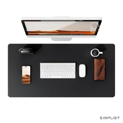
Bonus: Try Simplist Colorfull Desk Mats to easily add your selected color to your workspace: